40. And the big, and final, design change for this article is the move to the “flat” look. Think Windows 8… Notice how all the gradients and curves are gone? This is currently where we are living today as far as UI and Site design goes. Apple kind-of-sort-of tried to do “flat” when they went to iOS 7 but they didn’t quite pull it off. If you have ever worked on Windows Server 2012 or newer… that pretty much is “flat” to the “t” (and has usability issues as a result as well…). I have mixed feelings on the mass movement towards “flat” design, but overall think it is a good thing as it is much more visually useful and less distracting. Kiloroot.com also makes use of a “flat” design as does the default WordPress theme. One of my favorite articles on the topic can be read here: http://sixrevisions.com/user-interface/when-flat-design-falls-flat/
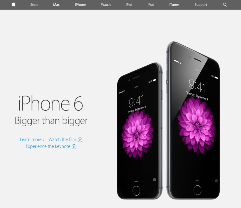
Oh yes… the iPhone 6 was also released. I guess that is important :). Apple finally got on the big-screen-bandwagon. The 6 was also an excellent design refresh. The 6 Plus however… not so much. I was amazed they had 11% more front surface area for a 5.5″ display vs. the LG G3 (also with a 5.5″ display). This makes a huge difference as it comes out to a little over 2 square inches of device with no additional functionality. This made the 6 Plus look dated, large, and unwieldy and I hope they are able to slim down their next large phone significantly. Hence the marketing slogan “Bigger than bigger” was unfortunately quite accurate, if not in the intended sense.
I looked at several 5.5″ devices when selecting a new phone and the G3 was the only one that didn’t feel ridiculously large. The 6 Plus however was a behemoth next to pretty much every other 5.5″ phone. It’s one saving grace was that it was at least very thin. So, at least for me, thumbs up for the iPhone 6, and a request to go back to the drawing board for the 6 plus. I think the latter device would have had Steve Jobs banging his head against the wall.
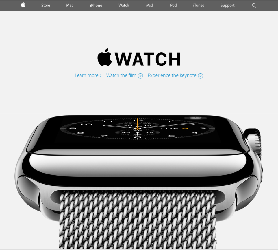
41. Bringing us almost to the end or this post (and 2014) is the Apple Watch. Apple’s first “new” product in a few years. In a typical Apple fashion, the device has earned high marks for excellent design, look, and feel. It has a lot of bells and whistles but is ultimately hampered by short battery life and the requirement of being tied to an iPhone. Hopefully some of those limitation will be overcome in gen 2. Also in typical Apple fashion, the Apple Watch comes in several ridiculously expensive variants.
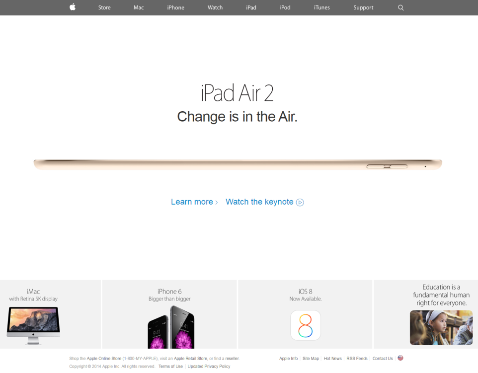
42. To finish out this series with the end of 2014, the iPad Air 2. The current pinnacle of Apple Mobile tech as far as truly portable computing power goes. The iPad Air 2 introduced, incredibly enough, and even thinner chassis and a much improved processor.
With the iPhone 6 and 1st generation iPad Air, Apple also introduced the fingerprint scanner and Apple Pay. The combination of the two makes for, at least on a surface review, a very secure and easy to use payment model that may very well see more and more US retailers embracing alternate payment forms.
Well, that concludes my nostalgic look through 18 years of Apple and peripherally the internet, technology, and website design. If hope you have enjoyed reading all of my musings (or blithely skipping over them :)…) and watching the tech world evolve from one year to the next. Enjoy the rest of your weekend!